In every area of your marketing campaigns, you need to be ultra-focused on CONVERSIONS.
After all, we know that acquiring traffic, subscribers and customers is damned expensive, so it's important that we make the most of it in every area of our business.
Sometimes it's amazing how simple strategies can create an incredible BOOST in conversions – and every % bump makes a huge difference to your bottom line.
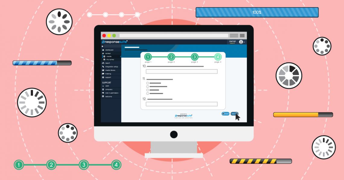
That's why we (proudly!) just introduced ‘Progress Bars' as a feature in ResponseSuite.
If your survey has multiple pages, it's really useful to be able to keep your visitors ‘in the loop' about where they are in the process.
They can see where they have been, where they are and where they are going.
[bctt tweet=”We've found that popping a progress bar onto the top of your survey really helps to encourage people to keep going and fill out your survey, right the way to the end.” username=”responsesuite”]Right now, there are TWO styles of progress bar…
Option 1: The Steps Bar
No, it's nothing to do with the British pop band from the 90's.
It's just a handy-dandy way to show your visitors each page of the survey and show them where they are.

Option 2: The Percentage Bar
Show your subscribers how far through they process they are as a ‘chunk'.

We're super-chuffed with how these both look – and you can customise them with words, numbers, colours and even stripes, to make them suit your brand.
It couldn't be easier.
Just drag, drop, click and customise!
It's like magic (with stripes on).
Go check it out in your ResponseSuite account (or sign up today at: https://get.responsesuite.com)
—-
PS. As if that wasn't enough, we've also just rolled out ‘Open Graph' tag + image functionality into your surveys. That means you can upload a ‘share' image, title and description to make your surveys look even more beautiful when you share them on the socials!


Leave a Comment